Social Media
Twitter rolls out its redesigned desktop website with simplified navigation, more features

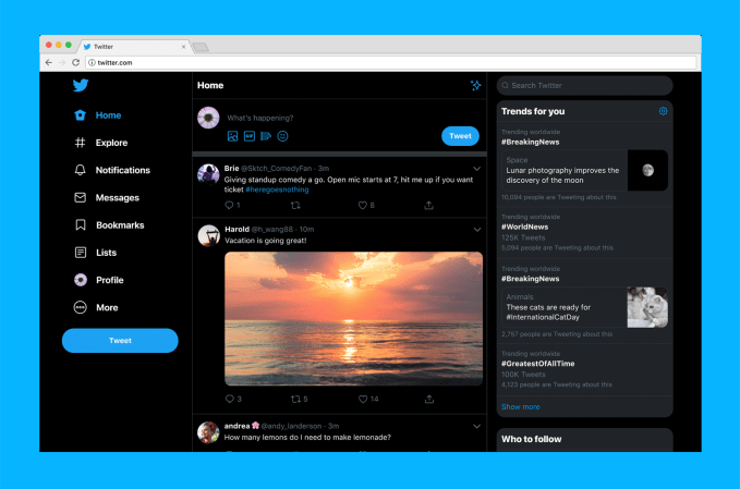
Twitter’s website is getting a major overhaul. The company has been testing a new version of its desktop website since the beginning of the year, and today the final product is rolling out to the public. The upgraded experience simplifies navigation with a new — and fairly large — left-hand sidebar that directs you to all of Twitter’s key sections, including Notifications, Direct Messages, Explore, Bookmarks, Lists, and more. The site also features an expanded, more inbox-like Direct Messages screen where you can view and respond to conversations in one place; plus easy profile switching, support for more themes, advanced search, and other features.
The popular dark modes, Dim and the very black Lights Out mode, are now supported along with more ways to personalize Twitter through different themes and color options.
But the most noticeable change is the organization and layout of the Twitter home screen itself.
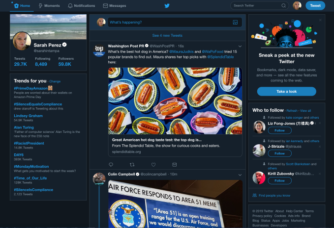
Below: the old Twitter.com
 Below: the new Twitter.com
The update is designed to make it easier to move around Twitter. Before, you’d have to click on your Profile icon to access features like Lists, Themes, Settings, and other options. Meanwhile, getting to Moments was available both in this Profile dropdown menu and in the main Twitter navigation at the top of the screen, next to Notifications and Messages.
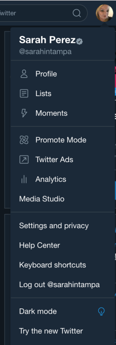
Now, Moments is being downgraded to the “More” menu in the redesign — as seen in a test running earlier this summer — and Explore instead gets the top billing. As on mobile, Explore will direct users to more live videos and personalized local moments, says Twitter. This is also where you’ll find Top Trends, while Personalized Trends will be featured on the right-hand sidebar on the home screen. (See above).
In addition, Twitter finally brought the over a year old Bookmarks feature to the desktop’s main navigation.
With the update, the new navigation menu includes: Home, Explore, Notifications, Messages, Bookmarks, Lists, Profile, and then More — the latter, a menu where you’ll find things like Moments, Twitter’s ad tools, Settings, and other features.
The new Compose feature has been slightly tweaked as well, with options to include a photo, GIF, poll or emoji now all in the bottom left — with the emoji button now swapping in for the location button, following Twitter’s decision to make sharing precise location less of a priority, given its lack of use.
Though the new home screen is arguably better-organized, the navigation text itself and the amount of screen real estate it takes up is overly large.
This detracts somewhat from the main content — the tweets themselves — because your eye is naturally drawn to the oversize navigation labels at first, not the posts flowing in the timeline. This can also be a jarring change to get used to for longtime Twitter.com users. (Good thing there’s a new Mac desktop app on the way.)
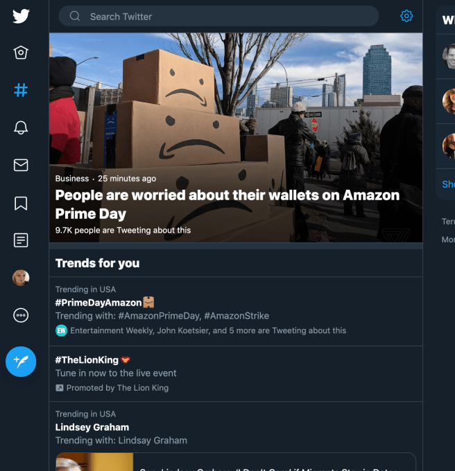
If you really can’t stand the navigation labels’ size, you can make the webpage smaller which then hides the text labels of the navigation items, leaving only their icons. This, unfortunately, isn’t all that useful if you like to keep Twitter open in a tab alongside all your other tabs. It works better if you pop out Twitter.com into its own window.
The navigation changes were likely a design choice Twitter made, in part, to simplify the use of its product by more casual users and newcomers.
The company has struggled with user growth throughout its history, even changing how it reports metrics to paint a better picture of its business. Now, you’d have to be almost completely web illiterate to not find your way around the new Twitter.com. But only time will tell what effect this has on growing its user base.
Not all the changes will be as controversial as the new layout, though.
For example, the now double-paned Direct Message section is more welcome as it makes using Messages feel more like the real inbox it often is — with the message list on the left and conversations on the right.
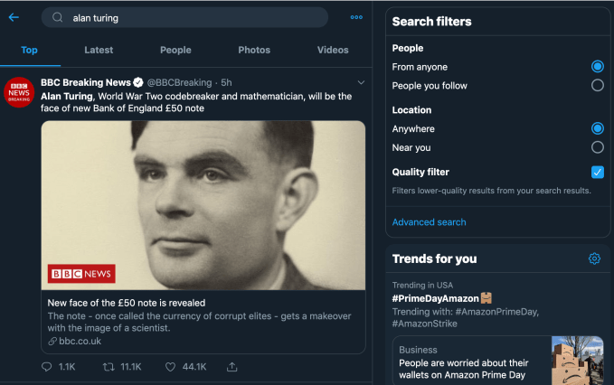
Search got an update, as well, which puts tabs for moving between “Top,” “Latest,” “People,” “Photos,” and “Videos” at the top of the screen, with Advanced Search Filters to the right.
And for those with multiple Twitter accounts, you can now switch between them from the main navigation. That’s helpful.
Twitter’s tests of the updated design had been rolling out to more people throughout the year — it even tried two different versions for a time. Throughout this process, the company incorporated some of the user feedback it received. For example, the changes to the Messaging screen and the high priority given to Bookmarks were among the requests Twitter addressed.
But generally speaking, Twitter was aiming to deliver a more consistent, seamless experience across both the phone and the web platforms with this update, a company spokesperson told us.
There’s some bad news for old school Twitter.com users — as of this public launch of the redesign, there’s no option for going back to the legacy experience, as there was during the testing period.
Twitter says the upgraded look will begin rolling out globally starting today.
-

 Entertainment6 days ago
‘Presence’s Steven Soderbergh and David Koepp on ghosts, horror, and hating winks
-

 Entertainment7 days ago
What are immigration red cards? How the internet is rallying behind undocumented workers
-

 Entertainment6 days ago
‘Pee-wee as Himself’ review: Paul Reubens’ documentary is a must-see for ‘Playhouse’ fans
-

 Entertainment6 days ago
TikTok ban: Influencers brace for an uncertain future
-

 Entertainment5 days ago
Films by Black creators to watch on Netflix
-

 Entertainment3 days ago
‘Dimension 20’s ‘Gauntlet at the Garden’ was a euphoric experience for ‘Dungeons and Dragons’ fans everywhere
-

 Entertainment6 days ago
How to stop doomscrolling with apps you already have
-

 Entertainment3 days ago
‘If I Had Legs, I’d Kick You’ review: Rose Byrne stuns in nauseating thrill ride about motherhood


