Social Media
Twitter brings Bookmarks to the web with a new design, now in testing


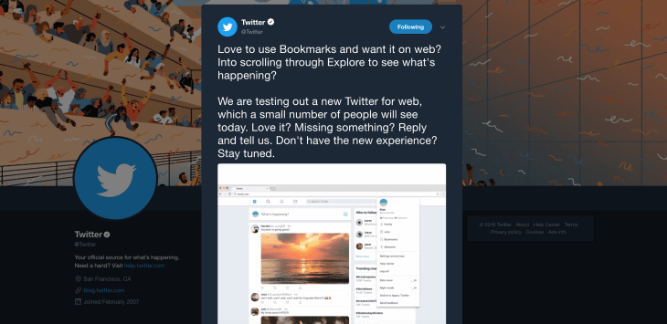
Twitter is testing a new experience for web users, the company announced in a tweet on Thursday. A small number of Twitter users will see the updated version of Twitter for web, which will include access to Twitter’s Bookmarks feature, and scrolling through Twitter’s Explore section, the tweet said and a spokesperson confirmed.
However, Business Insider grabbed screenshots of the opt-in pop-up that appears when you’re invited to test the revamped website, which promises other features like night mode, data saver, and more.
These are not necessarily “new” features though – Twitter rolled out its dark themed “Night Mode” to the web client a year ago.
The differences appear to be more subtle, as it turns out. For example, Night Mode is now a toggle switch, as is Data Saver, instead of an option to click on from your settings menu.
Trends also shifted from one side of the home page to the other, underneath the “Who to Follow” suggestions, which gives the interface a cleaner, more organized appearance.
The “Compose Tweet” pop up looks different as well. Instead of a boxed-in rectangular area to write in, it’s more of an open space with an underline. The “Location” button is missing on Compose, too, and the “Tweet” button has moved to the top.
The addition of Bookmarks to the web client is the biggest and most welcome change. The feature publicly launched in February of this year on mobile platforms, but had not yet made it to the web. None of the other tweaks seem to be radical changes, though – not like the update that turned Twitter’s stars into hearts, for instance, or the one that introduced threads.
Twitter declined to say how many users were being opted in at present, or when the experience would roll out more broadly. But if you’re being offered the opt-in, you’ll see it
-

 Entertainment7 days ago
I went to the ‘Severance’ pop-up in Grand Central Station. It was wild.
-

 Entertainment6 days ago
What’s new to streaming this week? (Jan. 17, 2025)
-

 Entertainment6 days ago
Explainer: Age-verification bills for porn and social media
-

 Entertainment5 days ago
If TikTok is banned in the U.S., this is what it will look like for everyone else
-

 Entertainment5 days ago
‘Night Call’ review: A bad day on the job makes for a superb action movie
-

 Entertainment5 days ago
How ‘Grand Theft Hamlet’ evolved from lockdown escape to Shakespearean success
-

 Entertainment5 days ago
‘September 5’ review: a blinkered, noncommittal thriller about an Olympic hostage crisis
-

 Entertainment5 days ago
‘Back in Action’ review: Cameron Diaz and Jamie Foxx team up for Gen X action-comedy


