Social Media
Clubhouse UX teardown: A closer look at homepage curation, follow hooks and other features

Clubhouse, the social audio app that first took Silicon Valley by storm and is now gaining much wider appeal, is an interesting user experience case study.
Hockey-stick growth — 8 million global downloads as of last month, despite still being in a pre-launch, invite-only mode, according to App Annie — is something most startups would kill for. However, it also means that UX problems can only be addressed while in “full flight” — and that changes to the user experience will be felt at scale rather under the cover of a small, loyal and (usually) forgiving user base.
In our latest UX teardown, Built for Mars founder and UX expert Peter Ramsey and TechCrunch reporter Steve O’Hear discuss some of Clubhouse’s UX challenges as it continues to onboard new users at pace while striving to create enough stickiness to keep them active.
Homepage curation
Peter Ramsey: Content feeds are notoriously difficult to get right. Which posts should you see? How should you order them? How do you filter out the noise?
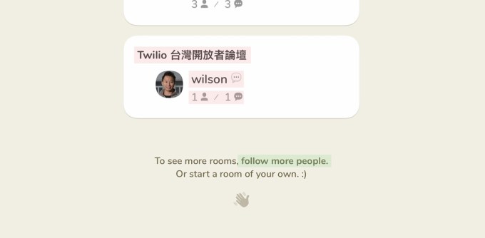
On Clubhouse, once you’ve scrolled past all the available rooms in your feed, you’re prompted to follow more people to see more rooms. In other words, Clubhouse is inadvertently describing how it decides what content you see, i.e., your homepage is a curated list of rooms based on people you follow.
Except there’s a problem: I don’t follow half the people who already appear in my feed.

Image Credits: Clubhouse
Steve O’Hear: I get it. This could be confusing, but why does it actually matter? Won’t people just continue to use the homepage regardless?
Peter: In the short term, yes. People will use the homepage in the same way they’d use Instagram’s search page (which is to just browse occasionally). But in the long term, this content needs to be consistently relevant or people will lose interest.
Steve: But Twitter has a search page that shows random content that I don’t control.
Peter: Yeah, but they also have a home feed that you do control. It’s fine to also have the more random “slot machine style” content feed — but you need the base layer.
The truth about aha moments
Peter: In the early days of Twitter, the team noticed something in their data: When people follow at least 30 others, they’re far more likely to stick around. This is often described as an “aha moment” — the moment that the utility of a product really clicks for the user.
This story has become startup folklore, and I’ve worked with many companies who take this message too literally, forgetting the nuance of what they really found: It’s not enough to just follow 30 random people — you need to follow 30 people who you genuinely care about.
Clubhouse has clearly adopted a similar methodology, by pre-selecting 50 people for you to follow while signing up.
Have you noticed that some people have accumulated millions of followers really quickly? It’s because the same people are almost always recommended — I tried creating accounts with polar opposite interests, and the same people were pre-selected almost every time.
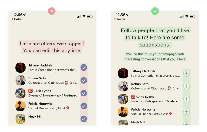
At no point does it explain that following those 50 people will directly impact the content that is available to you, or that if your homepage gets uninteresting, you’ll need to unfollow these people individually.
But they should, and it could look more like this:

Steve: Why do you think Clubhouse does this? Laziness?
Peter: I think in the early days of Clubhouse they just wanted to maximize connections, and by always recommending the same people (Clubhouse’s founders and investors), they could somewhat control the content that is shown to new users.
-

 Entertainment7 days ago
‘Interior Chinatown’ review: A very ambitious, very meta police procedural spoof
-

 Entertainment6 days ago
Earth’s mini moon could be a chunk of the big moon, scientists say
-

 Entertainment6 days ago
The space station is leaking. Why it hasn’t imperiled the mission.
-

 Entertainment5 days ago
‘Dune: Prophecy’ review: The Bene Gesserit shine in this sci-fi showstopper
-

 Entertainment4 days ago
Black Friday 2024: The greatest early deals in Australia – live now
-

 Entertainment3 days ago
How to watch ‘Smile 2’ at home: When is it streaming?
-

 Entertainment3 days ago
‘Wicked’ review: Ariana Grande and Cynthia Erivo aspire to movie musical magic
-

 Entertainment2 days ago
A24 is selling chocolate now. But what would their films actually taste like?


