Business
Email app Spark receives update with new design

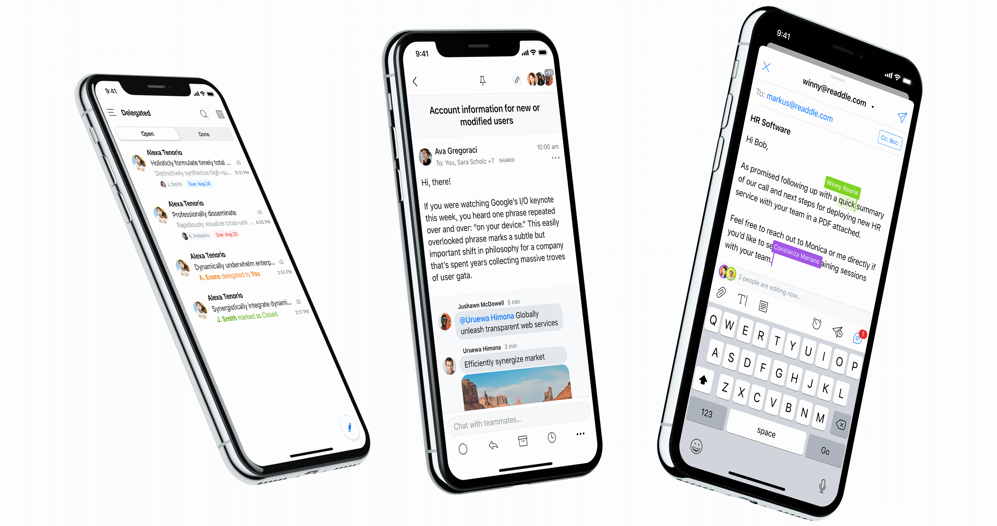
Spark, the popular email app from Readdle, has been redesigned on iOS and Android. The interface has always been a bit busy in the mobile app. That’s why the updated app now features a cleaner design and a handful of new features.

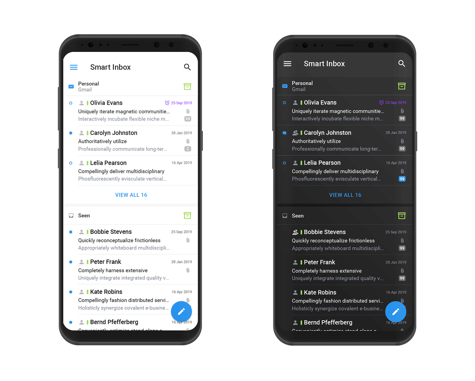
On the design front, Spark now uses simple headers to separate smart sections, such as newsletters, notifications and personal emails. It looks better than the rounded boxes with a colorful background.
There’s a lot of whitespace now, but the company has also taken advantage of this update to add dark mode. When you tap on a thread, the thread view has been updated as well.

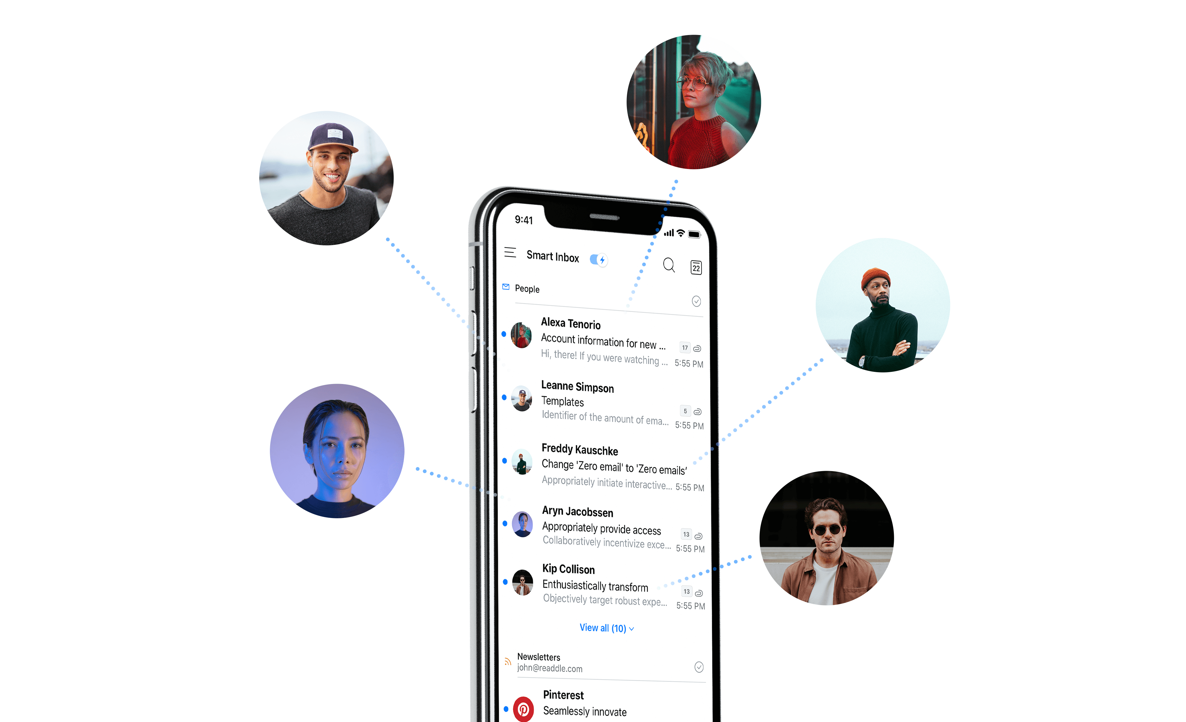
When it comes to new features, the app tries to autopopulate your inbox with profile pictures. Just like Vignette, it pulls images from popular web services. For instance, if somebody who emails you has a Twitter account under the same email address, Spark can add the Twitter profile picture to your inbox.
Everybody has their own way of dealing with their email inbox. That’s why Spark lets you choose the buttons that appear at the bottom of an email thread. For instance, if you use folders a lot, you can put a folder button. But if you want to replace that button with a snooze button, you can.
Spark is now a better citizen on iPadOS 13. You can open multiple instances of Spark. This way, you can work on a document with an email thread using Split View and you can open a second Spark window to check your inbox in a separate workspace. Spark on iPadOS also supports the floating keyboard and new iPadOS gestures.

-

 Entertainment7 days ago
Earth’s mini moon could be a chunk of the big moon, scientists say
-

 Entertainment7 days ago
The space station is leaking. Why it hasn’t imperiled the mission.
-

 Entertainment6 days ago
‘Dune: Prophecy’ review: The Bene Gesserit shine in this sci-fi showstopper
-

 Entertainment5 days ago
Black Friday 2024: The greatest early deals in Australia – live now
-

 Entertainment4 days ago
How to watch ‘Smile 2’ at home: When is it streaming?
-

 Entertainment3 days ago
‘Wicked’ review: Ariana Grande and Cynthia Erivo aspire to movie musical magic
-

 Entertainment2 days ago
A24 is selling chocolate now. But what would their films actually taste like?
-

 Entertainment3 days ago
New teen video-viewing guidelines: What you should know


